Kerala Plus Two Computerised Accounting Chapter Wise Questions and Answers Chapter 4 Graphs and Charts for Business Data
Plus Two Accountancy Graphs and Charts for Business Data One Mark Questions and Answers
Question 1.
_____________ are the visual representation of numerical data
Answer:
Chart/ Graph
Question 2.
Chart / Graph has at least ____________ dimenstional relationship
(a) Two
(b) Three
(c) Four
(d) Five
Answer:
(a) Two
Question 3.
____________ chart is suitable for comparing multiple.
Answer:
Bar Chart
Question 4.
In column chart, the X-axis shows
(a) Value of each category
(b) Different categories
(c) Height of the chart
(d) Depth of the value
Answer:
(b) Different categories
Question 5.
________ Chart is similar to the column chart, with the difference being that the data series are displayed horizontally
(a) Line chart
(b) Pie chart
(c) Barchart
(d) Area chart
Answer:
(c) Bar chart
Question 6.
________ chart shows data changes for a certain period of time.
Answer:
Line chart
Question 7.
_______ chart contains only one data series
Answer:
Pie chart
Question 8.
_______chart shows values as circular sectors to the total circle
Answer:
Pie chart
Question 9.
Pie chart don’t have more than __________ categories.
(a) Ten
(b) Twenty Five
(c) Seven
(d) Three
Answer:
(c) Seven
Question 10.
____________ is a pictorial representation of data, which has at least two dimensional relationships.
(a) Graph
(b) Chart
(c) Diagram
(d) All the above
Answer:
(d) All the above
Question 11.
_________ Chart is used to compare values across categories.
(a) Column chart
(b) Line chart
(c) Pie chart
(d) Barchart
Answer:
(a) Column chart
Question 12.
_________ chart is used to display trends over time.
Answer:
Line chart
Question 13.
The entire chart including all elements is termed as ________
Answer:
Chart area
Question 14.
In 3D chart, the area is bounded by three axes ie _____, _____ & _____
Answer:
X, Y, Z
Question 15.
In ______ chart, both axes display values ie they have no category axis.
Answer:
XY Chart or Scatter diagram
Question 16.
_______ specifices the colour, symbol or pattern used to mark data series.
Answer:
Legends
Question 17.
The change the location of a chart, right click the chart and select.
(a) Chart Type
(b) Source Data
(c) Move here
(d) Chart Options
Answer:
(c) Move here
Question 18.
In 3D chart X, Y & Z axes are used to show
(a) Category, Value, Total
(b) Depth, Vertical, Horizontal
(c) Length, Breadth, Depth
(d) Category, Value, Series.
Answer:
(d) Category, Value, Series
Question 19.
Legand can be repositioned on the chart
(a) Anywhere
(b) On right side only
(c) On the corner only
(d) On the left side only
Answer:
(a) Anywhere
Question 20.
Which chart element details the data values and categories below the chart?
(a) Data table
(b) Data marker
(c) Data labels
(d) Datapoint
Answer:
(c) Data labels
Question 21.
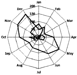
Which type of chart is this?
Answer:
Radar chart
Question 22.
The intersection of both the axis (X-axis and Y-axis) is called __________ of the graph.
Answer:
Origin (0)
Question 23.
_________ Chart display in rings, where each ring represents a data series
Answer:
Doughnut chart.
Question 24.
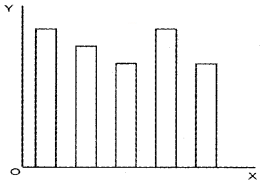
Name the given chart
Answer:
Bar Chart
Question 25.
In _________ chart, the area below the plotted lines is solid
Answer:
Area chart.
Question 26.
Radar chart / Net chart is also known as ______
(a) Doughnut chart
(b) Pie chart
(c) Ara chart
(d) Star chart
Answer:
(d) Star chart
Question 27.
Which among the following is the special feature of 3D chart
(a) Chart area
(b) X & Y axes
(c) Chart wall
(d) Legend
Answer:
(c) Chart wall
Question 28.
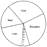
Give a suitable name to the diagram
(a) Barchart
(b) Single line graph
(c) Pie chart
(d) Area Chart
Answer:
(c) Pie Chart
Plus Two Accountancy Graphs and Charts for Business Data Two Mark Questions and Answers
Question 1.
Name the different chart formats in Libre Office Calc
Answer:
Barchart, Column Chart, Pie chart, Line chart, Area chart, Doughnut chart, etc.
Question 2.
What is the importance of charts and graphs in business?
Answer:
- Chart and graphs covey lots of business information in a visual format
- Different business Data variables plotted in charts and graphs show the trend of the business in an easy way
Question 3.
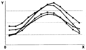
Identify the type of chart
Answer:
Line chart
Question 4.
Give a short note on it.
- Barchart
- Pie chart
Answer:
1. Bar Chart
This type of chart shows a bar graph or column chart with horizontal bars. The Y-axis shows categories and the X-axis shows the value for each category. It is suitable for comparing multiple values.
2. Pie chart
A pie chart displays the contribution of each value to a total. It represents multiple subgroup of a single variable. It contains only one data series. A pie chart shows values as circular sectors of the total circle. Pie chart may be
- Normal Pie chart
- Exploded Pie chart
- Doughnut chart or Donut chart
- Exploded Doughnut chart
Question 5.
What are the special features of graphs and charts?
Answer:
- Graphs/charts are the pictorial representation of business data
- A chart represents tabular numeric data
- Dimensions in the data are often displayed on axes (X, Y, & Z)
Question 6.
Differentiate between Chart area and Chart wall?
Answer:
1. Chart area:
This is the total space that is enclosed by a chart. It is the background of the chart.
2. Chart wall:
In 2D chart, the wall or area is bounded by the X and Y-axis. In the 3D chart, the wall is bounded by three axes X, Y and Z
Question 7.
Quarterly sales of a business firm is used to create a bar graph. Identify the Data variables plotted on X and Y-axis
Answer:
X-axis – Ist Quarter, IInd Quarter, IIIrd Quarter, IVth Quarter,
Y-axis – Sales in Ist Quarter, Sales in Ind Quarter, Sales in IIIrd Quarter, Sales in IVth Quarter
Question 8.
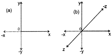
Identify the type of chart
Answer:
(a) 2D Chart
(b) 3D Chart
Question 9.
What is the use of Auto shapes in LibreOffice Calc?
Answer:
Auto shapes tool bar allows drawing a number of geometrical shapes, arrows; flow chart elements, etc.
Question 10.
What is PIE chart? What are the specialties of PIE chart.
Answer:
Pie chart:
A pie chart displays the contribution of each value to a total. It represents multiple subgroup of a single variable. It contains only one data series. A pie chart shows values as circular sectors of the total circle. Pie chart may be
- Normal Pie chart
- Exploded Pie chart
- Doughnut chart or Donut chart
- Exploded Doughnut chart
Question 11.
Choose the right statements from the following.
- We can put on the right side of the origin positive values and on left side of the origin negative values of data on X-axis
- The upward side of origin shows postiive values and downward side of the origin shows negative values of data on Y-axis.
- We can put on the right side of the origin negative values and on left side of the origin positive values of data on X-axis.
- The upward side of origin shows negative values and downward side of the origin shows positive values of data on Y-axis.
Answer:
Right statements a & b
Question 12.
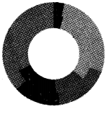
Identify the type of given chart. List down its features.
Answer:
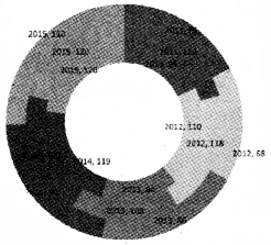
- It is a Doughnut chart
- Features of the doughnut chart
- It displays data in rings
- Each ring represents a data series
- The first data series is displayed in the center of the chart
Question 13.
What is a 3-D chart?
Answer:
Charts can be prepared with three dimensional (3-D) effects. 3- D charts have a third axis. The third axis is called as Z-axis. So a 3-D chart has the fol¬lowing dimensions.
- Horizontal axis – Indicate the category – known as X-axis
- Vertical axis – Indicate the derived values – known as Y-axis
- Depth axis – Indicate the series – known as Z-axis
Question 14
Differentiate between Data Marker and Data series.
Answer:
1. Data Marker:
Individual values plotted in a chart are called data marker or data point.
2. Data Series:
Data markers of the same colour or pattern is called data series.
Question 15.
Is there any difference between
- A column chart and
- A bar chart?
Substantiate your answer
Answer:
1. Column Chart:
It is the most commonly used chart type. It shows a bar chart or bar graph with vertical bars. The X-axis shows the categories and Y-axis shows the value for each category. Column chart are used to compare values across categories.
2. Bar Chart:
This type of chart shows a bar graph or column chart with horizontal bars. The Y-axis shows categories and the X-axis shows the value for each category. It is suitable for comparing multiple values.
Plus Two Accountancy Graphs and Charts for Business Data Three Mark Questions and Answers
Question 1.
Match the following
| A | B |
| (a) Area chart | (1). XY chart. |
| (b) Barchart | (2). Display contribution to a total. |
| (c) Pie chart | (3). Suited for comparing multiple values. |
| (d) Scatter chart | (4). Display differences between several sets of data over a period of time. |
Answer:
| A | B |
| (a) Area chart | (1). Display differences between several sets of data over a period of time. |
| (b) Barchart | (2). Suited for comparing multiple values. |
| (c) Pie chart | (3). Display contribution to a total. |
| (d) Scatter chart | (4). XY chart. |
Question 2.
What are the advantages of using Graph/ Chart?
Answer:
Advantages in using Graph/Chart:
- It summarises a large data set in visual form
- Charts or graphs can clarify trends better than do tables.
- It helps to estimate key values at a glance
- It shows each data category in a frequency distribution.
- It permits a visual check of the accuracy and reasonableness of calculations
- The charts and graphs allow the investigator to draw a valid conclusion.
Question 3.
What are the elements of a Chart/ Graph
Answer:
| Chart elements | Description |
| 1. Axes Titles | Mention the names or titles for X, Y and Z axes. |
| 2. X, Y, & Z axes | In 2D chart, the horizontal X-axis contains categories and the vertical Y-axis contains dependent values. In 3D chart, the Z-axis will also be there represents the depth which |
| 3. Chart Area | This is the total space that is enclosed by a chart. It is the background of the chart. |
| 4. Chart wall | In 2D chart, the wall or area is bounded by the X and Y-axis. In the 3D chart, the wall is bounded by three axes X, Y, and Z. |
| 5. Chart floor | The chart floor is the lower area in the 3D chart. |
| 6. Main Title/ sub Title | It is the explanatory heading of the chart. It identifies the purpose of a chart. |
| 7. Data Marker | Individual values plotted in a chart are called data marker or data point. |
| 8. Data Series | Data markers of the same colour or pattern is called data series. |
| 9. Legend | It is an identifier of a piece of information shown in the chart/ graph. The legends are assigned to the data series in a chart. |
| 10. Data Label | The value of the data series plotted in a chart is known as data label. |
| 11. Grid Lines | These are the vertical and horizontal lines that appear in a chart. It increases the readability of a chart. |
Question 4.
How to use word Art styles to format text.
Answer:
- Step 1: Click in the chart element that contains text to be changed.
- Step 2: Click on the format.
- Step 3: Click on word Art styles.
- Step 4: Choose suitable options related to text formating like text fill, text outlines, shadow, etc.
Plus Two Accountancy Graphs and Charts for Business Data Four Mark Questions and Answers
Question 1.
What are the difference between 2D charts and 3D charts
Answer:
| 2D Chart | 3D Chart |
| (a) The chart represents business data with just two dimensions | (a) The chart represents business data with three dimensions |
| (b) The two dimensions are length and height (No width) | (b) The Three dimensions are Length and Height and width (or depth) |
| (c) There are X-axis and Y-axis | (c) There is X-axis, Y-axis is and Z-axis |
| (d) The shape of the chart may be in the form of Rectangle, Square, Triangle, Polygon, etc | (d) The shape of the chart may be Cylinder, Cube, Pyramid, etc |
Question 2.
List out the steps to Rotate a chart.
Answer:
- Step 1. Select the plot area of the chart.
- Step 2. Click on the format tab.
- Step 3. Click on format selection.
- Step 4. Click on 3D Rotation and type a value of angle between 0° to 360° and then click close
- Step 5. Click on the chart area of the chart and click on format tab.
- Step 6. Click on shape effects and then click on Bevel and select a bevel option.
Question 3.
What are the different types of charts?
Answer:
- Column chart: column chart are used to compare values across categories
- Line chart: Line charts are used to display trends over time
- Pie chart: Pie charts display the contribution of each value to a total
- Bar chart: Bar charts are best suited for comparing multiple values
- Area chart: Area chart emphasis differences between several sets of data over a period of time.
- Scatter chart: (XY chart) This chart compares pairs of values.
- Radar chart: Display values relative to a centre point.
- Doughnut chart: It shows the relationship of parts to a whole. This chart display data in rings, where each ring represents a data series.
1. Column Chart:
It is the most commonly used chart type. It shows a bar chart or bar graph with vertical bars. The X-axis shows the categories and Y-axis shows the value for each category. Column chart are used to compare values across categories.
2. Line Chart:
A line chart shows values in the Y-axis and categories in X-axis. The Y values of each data series is connected by a line. Line chart shows data changes for a certain period of time.
3. Pie chart:
A pie chart displays the contribution of each value to a total. It represents multiple subgroup of a single variable. It contains only one data series. A pie chart shows values as circular sectors of the total circle. Pie chart may be
- Normal Pie chart
- Exploded Pie chart
- Doughnut chart or Donut chart
- Exploded Doughnut chart
4. Bar Chart:
This type of chart shows a bar graph or column chart with horizontal bars. The Y-axis shows categories and the X-axis shows the value for each category. It is suitable for comparing multiple values.
5. Area chart:
The chart shows values as points on the Y-axis. The X-axis shows categories. The Y values of each data series are connected by a line. The area between each two lines is filled with a colour.
6. Scatter chart:
Scatter chart is also known as XY chart. In this type of chart, both axes display values. This chart is used to show the relationship among two variables.
7. Radar chart:
It is also known as Net chart or Star chart. A radar chart has a separate axis for each category and the axes extend outward from the center of the chart. The value of each data point is plotted on the corresponding axis.
8. Doughnut chart:
Chart display in rings, where each ring represents a data series. The first data series is displayed in the centre of the chart.
Question 4.
Identify and explain the type of chart given below.
Answer:
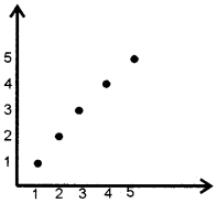
- This is scatter chart or XY chart.
- Features:
- Both axes display values (No category)
- This chart is used to show the relationship among two variables
- Generally this chart is used for scientific, statistical and engineering data
Question 5.
Match the following.
| A | B |
| (a) Legends | (i) Background of the chart |
| (b) Pie chart | (ii) Specifices the colour, symbol or pattern used to mark data series |
| (c) Grid Lines | (iii) Displays the contribution of each value to a total |
| (d) Chart Area | (iv) Display lines at the major intervals on the category X-axis and/or Y-axis |
Answer:
- (a) – (ii);
- (b) – (iii);
- (c) – (iv);
- (d) – (i)
Question 6.
How can we change the format of a selected chart element?
Answer:
- Step 1. Click anywhere in the chart.
- Step 2. Click format
- Step 3. Click format selection
- Step 4. Select a category (Fill border, style, etc)
- Step 5. Select formatting options
Question 7.
List down any four advantages of charts/ Graphs
Answer:
Advantages in using Graph/Chart:
- It summarises a large data set in visual form
- Charts or graphs can clarify trends better than do tables.
- It helps to estimate key values at a glance
- It shows each data category in a frequency distribution.
- It permits a visual check of the accuracy and reasonableness of calculations
- The charts and graphs allow the investigator to draw a valid conclusion.
Question 8.
What are the features of Charts/ Graphs in Libre Office Calc?
Answer:
- Chart is a graphical representation of data
- They are visual representation of numerical data
- Charts can be read more quickly than the raw data
- A chart has at least two axes – X and Y
Plus Two Accountancy Graphs and Charts for Business Data Five Mark Questions and Answers
Question 1.
What Pie Chart? What are the different types of Pie Chart?
Answer:
Pie chart:
A pie chart displays the contribution of each value to a total. It represents multiple subgroups of a single variable. It contains only one data series. A pie chart shows values as circular sectors of the total circle. Pie chart may be
- Normal Pie chart
- Exploded Pie chart
- Doughnut chart or Donut chart
- Exploded Doughnut chart
Question 2.
Name the different elements of given chart.
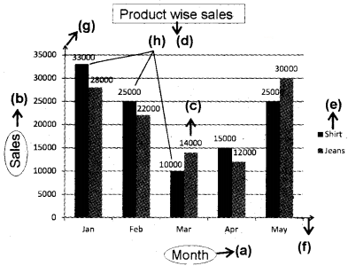
Answer:
- X-Axis Title
- Y-Axis Title
- Data label
- Main Title
- Legend
- X-Axis
- Y-Axis
- Data series
Question 3.
Write the steps of changing the chart type.
Answer:
- First select the chart by double-clicking on it. The chart should now be surrounded by a gray bonder
- Right-click on the chart and choose chart type.
- Select the replacement chart type.
- Click on [OK]
Question 4.
Write the steps for preparing a chart in Libre Office Calc.
Answer:
- Step 1: Enter the data in a worksheet with proper column and row titles
- Step 2: Select the range of data using the mouse
- Step 3: Click on Insert Tab → Object → Chart. Select a chart type from the “Choose a chart type” list in chart wizard window.
- Step 4: Naming chart, X-axis and Y-axis. Click on the chart → Right click → Insert titles (Names) → OK
- Step 5: Change the layout or styles of chart.
- Step 6: Show or hide a legend
- Step 7: Display or hide chart axes or gridlines
- Step 8: Move (resize) a chart
- Step 9: Save a chart
Plus Two Accountancy Graphs and Charts for Business Data Practical Lab Work Questions and Answers
Question 1.
Draw an Area Chart from the following
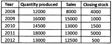
Procedure:
Step 1 – Open a new blanks worksheet in LibreOffice Calc
Step 2 – Enter the above data as follows.
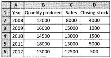
Step 3 – Select the range A1: D6 which is to be shown in the chart.
Step 4 – Click on Insert menu → Click on Chart → Chart wizard → Select Area Chart → Finish
Output:
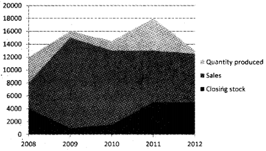
Question 2.
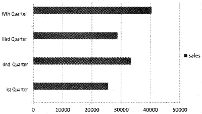
Quarterly sales of a product are given below. Draw a bar diagram/bar chart
| Ist Quarter | 25600 |
| IInd Quarter | 33400 |
| IIIrd Quarter | 28700 |
| IVth Quarter | 40400 |
Procedure:
Step 1 – Open a new blanks worksheet in LibreOffice Calc
Step 2 – Enter the above data as follows.
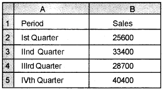
Step 3 – Select the range A1: B5 which is to be shown in the chart:
Step 4 – Click on Insert menu → Click on Chart → Chart wizard Click on Bar chart → Finish
Output:
Question 3.
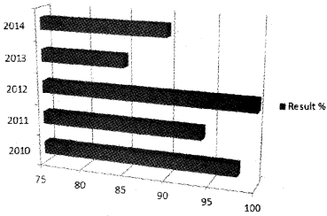
Draw a 3D column chart from the following details.
| Year | Result % |
| 2010 | 98 |
| 2011 | 94 |
| 2012 | 100 |
| 2013 | 85 |
| 2014 | 90 |
Procedure:
Step 1 – Open a new blank worksheet in LibreOffice Calc.
Step 2 – Enter the following data in the respective cells.
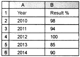
Step 3-Select the range A1: B6, which is to be shown in the chart.
Step 4 – Click on Insert menu → Click on Chart → Chart wizard → Click on Column Chart → Tick 3D Look → Select Bar Charts → Finish.
Output:
Question 4.
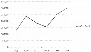
The net profits of a firm for the last six years are given below. Draw a line chart.
| Year | Net Profit |
| 2009 | 125800 |
| 2010 | 238400 |
| 2011 | 186500 |
| 2012 | 154900 |
| 2013 | 251000 |
| 2014 | 300000 |
Procedure:
Step 1 – Open a new blank worksheet in LibreOffice Calc
Step 2 – Enter the following data in the respective cells
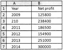
Step 3 – Select the range A1: B7, which is to be shown in the chart
Step4- Click on Insert menu → Click on Chart → Chart Wizard → Click on Line Chart → Finish
Output:
Question 5.
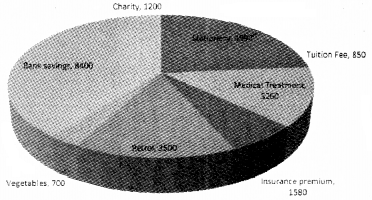
Enter the following data into a LibreOffice Calc worksheet and draw a 3D Pie chart.
| Item of Expenses | Amount |
| Stationery | 4890 |
| Tuition Fee | 850 |
| Medical Treatment | 3260 |
| Insurance premium | 1580 |
| Petrol | 3500 |
| Vegetables | 700 |
| Bank savings | 8400 |
| Charity | 1200 |
Procedure:
Step 1 – Open a new blank worksheet in LibreOffice Calc.
Step 2 – Enter the data in respective cells.
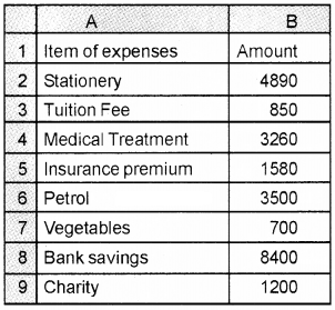
Step 3 – Select the range A2: B9, which is to be shown in the chart
Step 4 – Click on Insert menu → Click on Chart → Chart wizard → Click on Pie Chart Tick on 3D Look → Finish
Output:
Question 6.
Sales for the first six months in 2 years are given below. Draw a scatter chart in a LibreOffice Calc works sheet
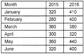
Procedure:
Step 1 – Open a blank worksheet in LibreOffice Calc.
Step 2 – Enter the data in the following cells.
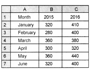
Step 3 – Select the range A1: C7, which is to be shown in the chart
Step 4 – Click on → Insert menu Click on → Chart → Chart Wizard → Scatter Chart→ Finish
Output:
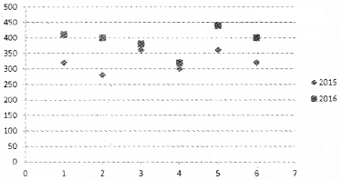
Question 7.
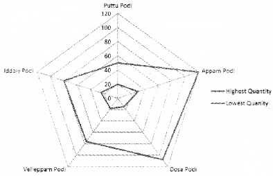
The production of different items in Oct. 2015 is listed below. Draw a Radar Chart
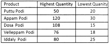
Procedure:
Step 1 – Open a blank worksheet in LibreOffice Calc.
Step 2 – Enter the data in the following cells.
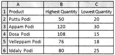
Step 3 – Select the range A1: C6, which is to be shown in the chart
Step 4 – Click on → Insert menu → Click on Chart → Chart Wizard → Click on Radar Chart → Finish
Output:
Question 8.
The following table shows the number of students passed in the higher secondary examination. Draw a doughnut chart.
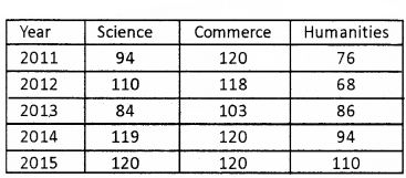
Procedure:
Step 1 – Open a blank worksheet in LibreOffice Calc.
Step 2- Enter the data in the following cells.
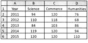
Step 3 – Select the range A1: D6, which is to be shown in the chart.
Step 4 – Click on → Insert menu → Click on Chart → Chart Wizard → Click on doughnut Chart → Finish.
Output:
