Distance Versus Time Graphs
Generally, a vehicle travelling on a road does not travel at a constant speed throughout its journey. If we note the distance travelled by the object at equal intervals of time (like every second or every minute), we will get a clearer picture of its speed at different points of time.
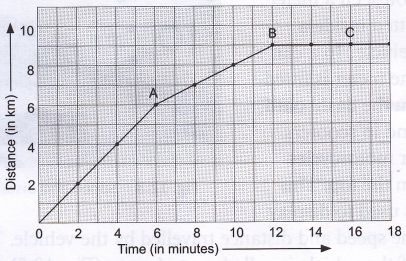
The data of the distance travelled and the time taken can be presented in many ways. One method would be to make a table. The information given in Table can also be represented in a graph as shown in Figure. This kind of a chart is called a line chart or line graph. It is created by plotting a series of data points and connecting them to form a line. In Figure, we have taken time on the x-axis and the distance on y-axis.
| Time (in min) | Distance (in km) |
| 2 | 2 |
| 4 | 4 |
| 6 | 6 |
| 8 | 7 |
| 10 | 8 |
| 12 | 9 |
| 14 | 9 |
| 16 | 9 |
| 18 | 9 |

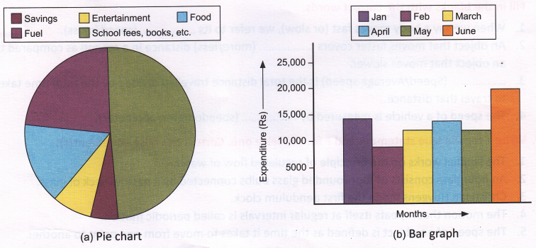
Other commonly used charts are bar graphs and pie charts. They are generally used for representing statistical data as shown below. Figure (a) represents household expenditures in a month through a pie chart. Figure (b) represents household expenditures over a period of six months through a bar graph.

Note: When we try to locate an object, we usually relate it to some sort of reference point. This point is usually the origin, the zero point of an axis (x or y). We provide a numeric value for an object’s location by placing it either in the positive direction (+) or the negative direction (-) in relation to that reference point. We usually take the starting point as the origin (x = 0).
We can get the following points by examining the distance-time graph:
1. The steepness of the slope of the graph gives the speed. If the slope is greater (i.e., if the slope is steeper as in line OA of above time and distance graph, the speed is greater than the speed shown by line AB because its slope is flatter).
2. The speed is zero if the graph is flat (i.e., parallel to the ‘time’ axis) as in BC.
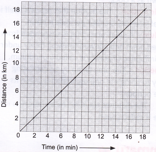
If we assume that the vehicle moves at constant speed, i.e., it covers the same distance in equal intervals of time, the data would be as shown in Table.
Now, if we plot a graph for these data, it will be as shown in Figure. The graph would be a steadily rising straight line. A motion that can be represented by a straight line as shown in graph is called uniform motion. In other words, a body is said to be in uniform motion if it covers equal distances in equal intervals of time. The motion of a body as shown in Figure is non-uniform as the speed does not remain constant.
| Time (in min) | Distance (in km) |
| 2 | 2 |
| 4 | 4 |
| 6 | 6 |
| 8 | 7 |
| 10 | 10 |
| 12 | 12 |
| 14 | 14 |
| 16 | 16 |
| 18 | 18 |

Activity
Aim: To plot the distance vs time graphs for uniform motion.
Materials needed: Graph paper and pencil.
Method:
- Take the speed at which the body moves as 10 m/s.
- Calculate the distance travelled by the body gt the end of 1, 2, 3, etc. (i.e., every second).
- Take time on the x-axis and distance travelled on the y-axis.
- Plot the distance vs time graph on a centimetre graph sheet taking 1 cm = 1 s.
- Repeat steps 2-4 for a speed of 50 m/s and 5 m/s on the same graph sheet.
- Observe the graphs obtained for different speeds.
Observation: A straight line graph is obtained.
Conclusion: The motion is a uniform type of motion.
